Zeigarnik Effect and Business Development
How businesses grow by using psychology

The Zeigarnik effect states that unfinished or interrupted tasks are better remembered than finished tasks. The theory was developed by Bluma Zeigarnik and it is a psychological model that has been used in business amply. Particularly in product development, product design and communication.
Because unfinished or interrupted tasks are better remembered, it generally results in higher user engagement and, thus, higher rate of recall and usage.
Synchronously, finished tasks are remembered more strongly on short term, due to the release of dopamine. Yet are forgotten much quicker as the task does not require any more attention (nor does it generate more dopamine).
In practice, you will remember better the mails that you still have to send than the ones that you already sent. This ramps-up as time progresses. Mails you sent today may still be fresh in your memory, but mails you sent two days ago not. While mails that you needed to send two days ago, will be fresher in your memory buffer.
Since most suffer from the effect, the effect can be triggered in a variety of ways. The trigger or deployment of the bias can include a call-to-action (a task) to ensure users act on, for example, a notification.
For example, free-to-play games on smartphones, notifying users about progression (or retrogression) and urging the user to act. There are also examples in which triggers are not as intrusive, like for example a sound from your phone signaling you have received a message.
Exploitation of the effect is widespread and virtually any industry can design triggers to activate the bias. Moreover, the activation of the bias is normally connected to other behavioral psychological pitfalls to increase attention, interaction and so forth.
Industries that use data as their primordial compass for growth, like the tech industry, maximize the results by designing triggers in their products that recall on this effect. In tech you can find it embedded in any social media platform, with for example a visual cue or noise about a feed update. Another example is progression bars when, for example, filling out a survey or form. In entertainment you can see it in how trailers are edited or the progression systems in video games.
Though the effect has been attributed to Zeigarnik and part of the theory have been (or attempted to) debunked or improved, in business, bigdata leads the movement of triggering the actual customer or potential customer to use a certain service or product. Thus, triggering action has the leading role, and not necessarily as the effect was originally hypothesized.
How to Use Zeigarnik Effect for Business Development
The Zeigarnik effect can be used for business development in different ways.
I will aim to keep it a little bit broader to explain, as the use case for this effect can be effective internally and externally in virtually any company. Though, it is my intention to explain it from an external perspective (what the target group for a certain product or service see).
Now, the first and foremost important thing to understand is that there needs to be a task for the user or customer to complete.
Design task with Zeigarnik Effect in mind
Designing the product or service in a task-oriented way will yield the best results for the effect to properly bloom.
Important while designing the task is that finishing the task has an emotional benefit for the person completing the task. If there is no benefit for the target, there will be zero appeal to the reward system, thus making the task pointless to the target.
This is why survey’s nearly always offer something for someone filling it (even though the actual reward is chance based). On the same note, about surveys, progression bars also show users how far they are into it (commitment) before they receive such reward – you can design multiple tasks to compound the Zeigarnik effect.
A reward does not always need to be clear for the person exposed – nor does the task for that matter –, it needs to be clear how the task in question benefits the user. Important to note, again, is that the task needs to appeal to the reward system of the person exposed.
Here is one thing you need to understand, and remember, people buy (with) emotions. Not stuff.
“We buy emotions, not stuff.”
Imagine you are tasked with creating an ad for a beer manufacturer in Amsterdam – one can refute to describe an ad as an actual task for viewers. Please bear with me.
It is your first gig and you are tasked to create a commercial that is going to be shown on the information screens in public transport – alcohol advertisings are heavily regulated, this case is hypothetical, keep bearing with me –, and you would like to use the Zeigarnik effect in the commercial to maximize the impact.
You created a story board of the hero’s journey and have tasked a production company to produce the ad. Since you designed the hero’s journey while keeping the spirit of the Zeigarnik effect intact, you want to guide post-production on how to edit the ad.
In the spirit of the target group, the ad starts with a middle-age man walking through the dessert. He is using his shirt to protect is head from the sun. Sweat is dripping making the sand stick to the skin. The sun is beating down the man. He feels desperate, in all directions the man looks at, there is only more desperation looking back at him. There is absolutely nothing. The man must continue his journey for survival. His lips are cracked, his skin is cracking as well, it is obvious the man needs something to drink. Again, he looks everywhere, but he only sees sand. The sand is staring back now, it reminds our hero of the total desolation and emptiness. He needs a drink. Skin is starting to burn, it looks painful, but our hero seems to be gone beyond pain, he is not flinching. He needs a drink. Our hero continues. He cannot go on anymore, he needs something to drink, but everywhere he looks there is only emptiness. He drops to his knees, is about to fall face first in the sand. There is an end cut. Nothing else is shown. What will happen to our hero? What is the ad even about?
Trigger Zeigarnik Effect
Once the tasks have been defined and framed, the second part is to trigger the effect on users (deploy).
This can be done in non-intrusive ways, like how most leading companies do (which I generally advocate). In practicality, though, it will depend on the aggressiveness of a business and the life cycle of a product or service.
Products and services that have a very short life cycle will generally benefit more from an aggressive approach. Like you will often encounter in freemium applications. However, it is my experience that it impacts the churn rate proportionally to the aggressiveness of the approach.
“Churn rate is impacted proportionally to the aggressiveness of a business for user action”
The deployment generally needs to have a sensory feedback (or lack of) to trigger the cognitive bias. How deployment takes place is very specific to the business and the environment it operates and communicates with customers. You can check the morphological box article if you have trouble coming up with deployment options.
However, anything that calls for attention to the five senses suffices. Progression bars with surveys, pop-ups indicating mails that need to be read, a mail of your gym “demanding” you coming back and so-on.
Relying only on the cognitive bias (I must do) will generally yield poor result, though this is not always the case. People hardly “forget” to eat or drink or to fill their vehicles with petrol/electricity/food. People will “forget” that they need to do exercise.
Now back to the example we gave previously. The beer ad for public transport in Amsterdam.
We left the journey of our hero while he was almost about to drop on his knees and, possibly, pass out. That cut was made on purpose. We wanted at least one other random ad run in between the hero’s journey because we purposely split the advertising in half. We wanted tension for the viewer, with, let’s call it a cliffhanger, and leave the viewer in curiosity, before finishing the hero’s journey.
The trigger for the Zeigarnik effect, believe it or not, is the actual ad that was running in between, and not the ad itself. Do you want to know what happens to the hero? You will need to read the next sub-chapter and figure out what happened to the hero with cracked lips, burned skin and about to drop to his impending doom.
Task completed
Once the task has been completed by the user, the business may want to loop a task or do something different. There are some options to choose from:
- Ask the user to complete the task again;
- For example, doing the dishes another time.
- Compound the task for a major task (or quest);
- Buying the soap to do the dishes.
- Create new task;
- Mop the floor.
- Create multiple tasks;
- Doing the dishes and mopping the floor.
- Loop multiple tasks;
- Doing the dishes and mopping the floor ad nauseum.
Explaining the options above more in depth would require looking at different behavioral psychology theories, but in a nutshell, it nearly all revolves around dopamine. No, the examples above will likely not yield the amount of dopamine one would hope.
A completed task can also be, more specifically, viewed at what it has achieved for the user from an emotional perspective.
Let us go back to the example we gave previously. The ad for public transport in Amsterdam.
We left the journey with our hero while he was dropping down.
Our hero dropped. With the full weight of his body sand particles lifted. While the dust settles, it is clear that the hero cannot continue moving on. The end is near. The hero starts hearing some noise, it is distant but clear. He cannot place it. He wants to look up, but cannot, he is empty. The viewer can, they are vultures surrounding a prey that has nothing else to give. The camera pans back to the hero. We see him with his mouth open gasping for air. His eyes are open, the hero wants to cry but can’t. There is no moisture nor energy left for him to cry. The camera pans back in on the vultures. The camera zooms towards the vultures. The camera is close to focusing on the vultures, but it is not actually focusing on the vultures. The vultures are blurring and we can see what is beyond. They are clouds. From the clouds it is starting to rain. Drops start falling gently first on the lens (screen). Shortly after, there is so much rain falling that the viewer cannot see anything. The hero is engulfed in water. He can drink all he wants and is about to. But decides to look up. In front of him, the most tempting beer he has ever seen. Ice cold and full of life. He does not think twice, he has never been so full of energy, he gets up in one go and is about to chop the lid with his bare hands – here it is possible, do not try at home though –, but the beer is already open. He takes a sip. The background starts to blur and he is in the middle of a party it is about to become the best day of his life.

If done correctly, viewers of the hypothetical ad, will feel some type of emotion towards what they saw. The cut was not necessary to explain the effect but was meant to show that an absence of a trigger can also become a trigger for the Zeigarnik effect.
Now, at the beginning we mentioned this can be compounded or more tasks can be added for a better result. Imagine that we designed the ad to only end when a tram or bus is about to stop at popular sites like Leidseplein or Rembrandtplein (they are both popular locations in Amsterdam for leisure activities involving alcohol). That we cracked the heating in the tram to similar temperatures as the hero was experiencing and we give a similar task to the viewers. We could continue adding examples to amplify the effect, hopefully you get the idea.
Now let us leave the ad aside. More tasks do not mean better results. A quick lesson in product design: the best task is no task at all.
Sending e-mails to one hundred people is much more fun than having to manually send single handwritten mail to one hundred people (i.e. write by hand the contents, look for an address and write it down on the envelope, lick the stamp, lick the envelope and go to a mailbox to post it). It is also much more fun to not do dishes nor mop the floor, in accordance to the examples before.
Next is measuring the results. It will be kept brief.
Measuring the Zeigarnik Effect
You need to measure the results. Data should always be leading in business development and not necessarily a thesis. The simple reason is that not all shoe fits, and in some cases data can show a business an anti-thesis and create a competitive advantage by knowing something that a competitor does not.
A thesis is guiding, data is final. From the data, improve and, if needed, reiterate.
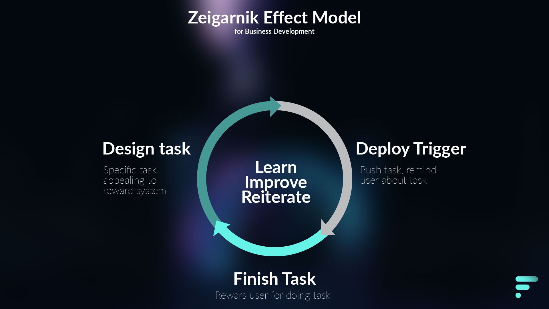
Zeigarnik Effect Business Development model
So why did I use a lite version of the hero’s journey as an example? Because the journey was the task for the actual hero, for the viewer it was to experience that task from an emotional perspective, while triggering all sorts of behavioral psychology shenanigans, so the viewer is motivated to do something specific. Which is drinking a specific beer brand.
For you though, esteemed reader, it was to give you not only an actual example with hopefully some type of emotional reward, but that you as well can use the hero’s journey as a guideline on how to use the Zeigarnik effect in whatever way you deem necessary.
Keep in mind that the effect improves drastically results, but is in no way a golden rule. It only amplifies the possibility for action, it is not a sure fire way for targets to actually act.
As a helpful tool, underneath you can use a model as a guide:

Serving customers by releasing dopamine
The Zeigarnik effect hypothesizes from a task perspective why an unfinished task is remembered more strongly than finished tasks and why we veer towards picking-up unfinished tasks more quickly. Which is the tension we experience during unfinished tasks (read: stress) and the release of tension (dopamine) once it is finished.
Now not necessarily everything can be viewed as tasks and not all tasks are viewed as equal. Watching a movie trailer is not necessarily a task on itself – despite what I mentioned earlier –, though the feelings it may convey (or the call-to-action [or task-needing-action] after the trailer ends) can translate into a task in the mind of the viewer. This is triggered by different types of emotions that release dopamine (curiosity, excitement, etc.).
Other times tasks are tedious, mundane or not important, and can therefore, not warrant any attention. For example, mowing the lawn.
A task can also be conveyed just in wording. Click-bait can make use of that, though click-bait generally makes a claim on our reward system and does not necessarily follow the “task” line. In the header it generally includes a question and some type of imperative verb that incites action to whomever is reading it.
- Read this whenever you feel like giving up;
- How to create a passive income machine;
And, for the sake to break the fourth wall again:
All the above have appeared on my Medium feed and are actual articles. The non-exception is the last one, which is the actual name the article will have once it appears on Medium.

Share this Page


